In 2019, the IFRC held its first data visualisation challenge intended to bring together data visualisation talent from across the Movement to think of innovative new ways of improving common operational information products.
Data visualisation helps data analysts describe and even prescribe. In this, we are inspired by the example of Florence Nightingale. Nightingale was a pioneer in the field using data visualizations, including her own invention, the ‘Nightingale rose’ diagram, to illustrate and advocate for the need for sanitary reforms to save lives.
In recognition of Florence’s contribution and inspiration, we’re renaming the challenge as the Nightingale Challenge, which this year is being run with the support of the British Red Cross.
This blog celebrates the entries we received, what we learnt and how we used the challenge to discover and explore new ways to display and understand the RCRC Movement ‘footprint’ of global solidarity with local reach.

What was the focus of the challenge?
In April 2020, the GO 3W was launched allowing National Societies to report on their activities. Entries from the 2019 Data Visualisation Challenge fed into the data visualisation design. Now, a year since launch, the 3W is being revisited and the Nightingale Challenge will contribute to improving the data visualisation used on GO. Guidance on the purpose of the 3W, lessons learned from other orgs and a video can all be found here.
We wanted designs for a user-focussed visualisation using the existing 3W data on GO (more in the challenge FAQ). It could have been a dashboard, infographic, map, chart, custom graphic — the aim was to simplify the data, make it easier to tell stories, gain insight and make decisions.
Quality over quantity
We received 13 submissions from a good mix and geographical spread of National Society and IFRC staff and volunteers. Despite hoping for more submissions, the quality of the designs more than made up for the quantity. It was amazing to see all the different approaches to the same problem with a consideration for the different user needs that were being addressed.
You can explore all the submissions by scrolling through the gallery below. By clicking on each submission you’re able to link to the interactive versions or download the originals and supporting documentation where relevant.
To select the winners, we first anonymised the entries before a panel then rated each design on four criteria:
- Storytelling — can you get insight from the visualisation?
- Simplicity — how user friendly is the design?
- Aesthetics — how elegant is the design?
- Creativity — how much does the design rethink 3W?
And the winner is….
It was hard to call with some designs clearly exceling in certain categories but there were a few that scored well across the board. The top three actually had very different approaches so they were all selected as winners under different categories. The winners selected were (in no particular order):
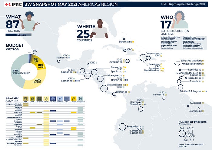
Lucía Martínez: Spanish Red Cross — for a single page, static visualisation
We really like Lucía’s use of colour and layout to make a visualisation that is packed full of information whilst being eye-catching and beautiful. All three of the who, what and where are covered on a single page and this would be fantastic for a summary report or monthly snapshot, as the title suggests.

Klaudia Jankowska: IFRC — for a multi-page wireframe based around GO
Klaudia spoke of her design based around GO which ‘has a place in her heart’. We couldn’t agree more and loved the three screen wireframe that looked at the 3W from three different use-cases: a general overview, enabling users to interrogate the global data; an operations manager view, to assess a specific emergency; and a Partner National Society (PNS) view, to see the impact of their projects. The design used GO style guide elements making it easy to see how the designs can be incorporated on to the platform.

JJ Agcaoili and collaborators: Philippine Red Cross — for a fresh and innovative approach
JJ submitted a design on behalf of a collaborative effort by the Philippine Red Cross Tech Response Team including data scientists Conner Manuel and Adrian Serapio, and mentored by Martin Gomez and Catherine Larracas.
The design was unlike anything else we’ve seen for the 3W, indeed for visualising emergencies in general, and was accompanied by an impressive explanation of the process.
The inspiration of the Nightingale rose was an added bonus to a very intriguing design. As acknowledged by JJ and the team, there is still some work to be done to ensure this design is understood and meets the user needs but it’s an exciting new approach that we hope to explore in the future.

What next?
Everyone who submitted an entry was invited to a training course with data visualisation expert Andy Kirk. During the session Andy ran through the fundamentals of data visualisation and gave time for participants to apply what they had learned to their designs. Everyone then presented their designs back to the group with a consideration of:
- What are you happiest about?
- What would you remove?
- What would you change?
- What would you add?
Hearing from the participants about their designs, it was great to hear the rationale behind their choices and self-reflection on how they could further improve their designs.
The winners were also invited to a follow up session to review their designs in more detail, with a focus on how these could be incorporated into the GO 3W upgrade — more to come on this soon.
Finally, we plan to document the process for the IFRC Data Playbook (which is currently being finalised) for others to run future challenges and improve the existing data viz ‘gallery session’ .
What did we learn?
Most importantly that there is a wealth of data visualisation talent across the Movement! Well, actually we already knew that, but it was great to see it applied to the 3W. By focusing on one product and without the time pressures of an emergency response, it was amazing to see all the different approaches — both from the various user needs addressed or from applying different perspectives from across the world.
We also learnt a lot about the process of running an open challenge and want to be open and honest about what didn’t work so well and what we’ve learnt for next time. Our initial reflections are:
- Our original aim to focus on user needs didn’t totally translate into the challenge — we need more end-user input across all stages of the challenge from the purpose to the review
- Categories should be defined up front (e.g. innovation, sketch/concept, interactive, etc.) — this way, participants could focus on a specific category and be judged alongside other similar approaches.
- Communicating widely is tough — how do we reach the right people across the Movement?
- What are people’s incentives? We mentioned that we’d have liked more submissions so first we need to understand why people took part, or why they did not!
We plan to finish off the whole process by gathering feedback and running a retrospective to better understand what worked and what didn’t. The plan is to make this an annual challenge so what can we do better next year?
